What Are We Exploring?

This project examines claims made by presidential candidates about factors that impact Americans’ daily lives. The goal of this project is to provide voters with a clear, data-driven understanding of key political issues: student loan debt, economic health, immigration, and crime. Through narrative visualizations, we aim to help voters make informed decisions based on facts and trends, rather than rhetoric alone.
Topics
- Immigration & Crime
- Economy
- Student Loans
Please note that since it can be difficult to evaluate some of the claims made by Harris (since she was never president, unlike Trump) we operate under the assumption that her policies would not deviate massively from Biden’s (since she is Biden’s vice president). Therefore, we sometimes evaluate claims made by Biden as a rough estimation of a Harris presidency.
Immigration and Crime
Immigration and crime were very hot and closely related topics from the previous election. While both candidates made claims regarding immigration and crime issues, Trump heavily focused on them throughout his campaign. In the following few subsections, we aim to disseminate some of the claims made by both candidates on those two topics, to examine their validity through visualization.
Flow of Undocumented Immigrants Into the US
Many Americans worry about the arrival of undocumented immigrants into the US and the potential effect they think they may have on society. This is very well known to both candidates, and therefore they both try to garner votes by making claims on this issue. On one side, Harris claimed that the Biden administration “halved the flow of immigrants” into the country. This was contradicted by Trump, however, who claimed that the Biden administration “spent millions” to bring millions of undocumented immigrants “from prisons, jails, and mental institutions to destroy our country”. He further claimed that the day he left office experienced the “lowest illegal immigration in US history”. We attempt to evaluate the validity of these claims via the following stacked line graph.
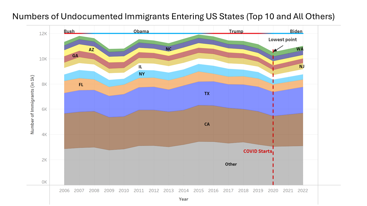
The line graph shows estimates of the amount of undocumented immigrants entering the US per year from 2006 through 2022 (except for 2021). The data is divided by state to show the top 10 states in terms of number of undocumented immigrants enter per year, and the rest of the states are lumped under “other”. The bar at the top of the plot reflects the party in control for each year, as well as the name of the president. The data used is obtained from the Office of Homeland Security and Statistics (OHSS). The graph demonstrates the following key takeaways:
- The lowest number of undocumented immigrants entering the country since 2006 indeed did occur towards the end of Trump’s presidency. While this confirms Trump’s claim, it is missing context. This is because this point occurred in 2020 when COVID-19 had a massive impact on travel and immigration in general.
- The number of undocumented immigrants entering the country experienced a steady decline throughout Trump’s presidency, the like of which was not seen with any other president from the reported data. This suggests that the Trump administration did enact policies that reduced the flow of undocumented immigrants.
- The lack of data makes it difficult to either validate or disprove Harris’ claim. However, the number of undocumented immigrants entering the country did experience an increase from 2020 to 2022, possibly suggesting an increasing trend and casting doubt on the claim.
- In general, there have been no sharp peaks or drops in the number of undocumented immigrants entering the country since 2006.
- During Biden’s presidency in 2022 only about 1.1 undocumented immigrants entered the country. This is a vastly different number from the millions Trump claimed Biden’s administration was letting in, highlighting Trump’s use of exaggeration.
- Texas and California are by a large margin the two most popular states for undocumented immigrants. This is most likely due to their location and California’s sanctuary policies, which we will discuss in further detail later.
Immigrants and Crime
When discussing immigrants, Trump did not stop at talking about his past and future policies. Instead, he elaborated on the effects he believes immigrants have on American society. He claimed that immigrants “poison the blood of our society”, referring to them as “animals” and “rough people”. He suggested that they commit violent crimes, thereby having a very adverse effect on society. These are very strong claims, which tend to elicit strong emotions of anger and hatred in many people. Therefore, it is crucial to examine their validity. We do so at a very surface level first by examining if the trend in average crime rate per 100k residents over all states and all types of crimes has a relationship with the average immigrant rate per 1M residents over all states and all documented immigrant statuses. This is depicted in the line graph shown next. Note that the term documented immigrants include asylees, refugees, naturalized individuals, legal permanent residents (LPRs), and unintuitively nonimmigrants (individuals on visas). The data displayed in this plot and the following ones are collected from the OHSS and the US Customs and Border Protection websites, both of which are reliable sources.
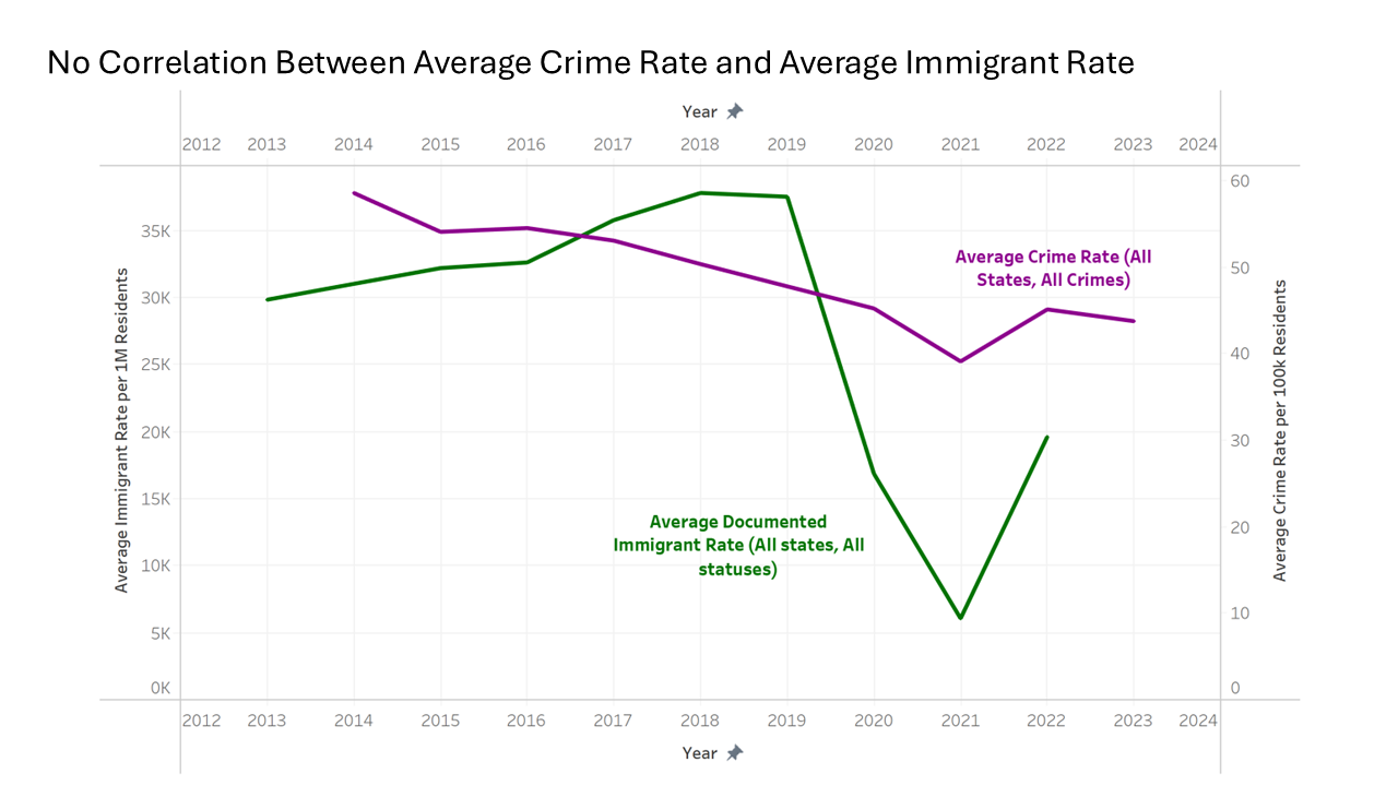
While correlation does not mean causation, we observe from the graph that there isn’t even a correlation between the two quantities. Perhaps the only similarity is that they both exhibit drops around 2020 and 2021, which were caused by COVID-19. However, whereas crime rates exhibited a steady decreasing trend, immigration exhibited an increasing trend before COVID-19. Therefore, if anything the quantities are negatively correlated! This plot also goes to show that immigration rates are not as astronomically high as some people may imagine. In fact, in the midst of Biden’s presidency in 2022 the average immigrant rate was lower than that seen in the first 3 years of Trump’s presidency. While data is not available for 2023 and 2024, this casts doubt on Trump’s claims that the Biden administration has “left the borders open” and that it has let millions of immigrants into the country.
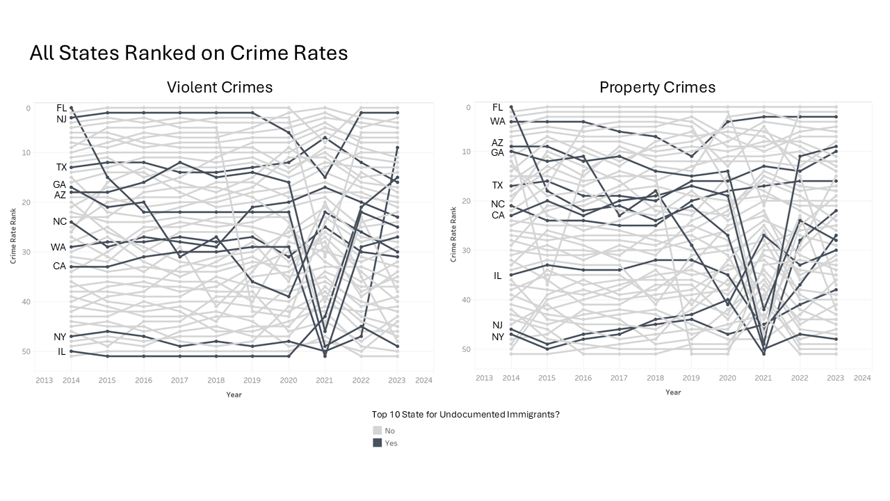
Some may argue that it is not the documented immigrants that are worrying, but rather the undocumented ones. Indeed, Trump has claimed that Biden’s administration has been bringing undocumented immigrants from “jails” and “mental asylums” from other countries and allowing them to enter the US. These “rough people” then allegedly commit very large amounts of violent crimes. We examine this claim via the two bump charts shown below, which rank all the states based on the rate of violent and property crime. The highlighted states are the top 10 states that undocumented immigrants flow into. We can observe from the charts that the top 10 states are distributed evenly across the 50 states in terms of crime rankings for both types of crimes. Therefore, there is no evidence that relatively large populations of undocumented immigrants result in higher crime rates. Moreover, it is interesting to see the sharp decline in crime rankings in many of the top 10 undocumented immigrant states in 2021. Some may be tempted to use this as evidence that immigrants commit crimes as COVID significantly reduced immigration in 2020. However, it is important to again highlight that correlation does not indicate causation. Indeed, while COVID did affect immigration, it also affected crime rates since there were much fewer people on the street, many people moved from the big states where they work or attend schools back to their home states, and many businesses were closed.
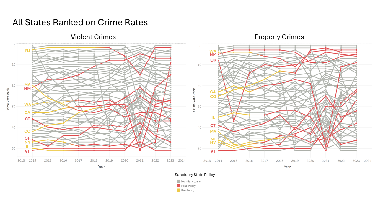
Another argument that could be made is that undocumented immigrants need not continue to stay in the state that they first resided in when they entered the US. Instead, they could move to another state where they have better opportunities or a lower risk of being deported. An alternative view we study this issue also utilized bump charts ranking the US states on violent and property crime rates but highlights sanctuary states instead. Sanctuary states are those where undocumented immigrants are granted some level of protection from deportation. The yellow portion encodes the period before the state enacted a sanctuary policy, whereas the red color shows that a sanctuary policy was enacted. The key takeaway from these plots is that the crime rate rankings of sanctuary states did not consistently increase or decrease after a sanctuary policy was implemented. This further suggests that undocumented immigrants do not cause a rise in crime in the areas where they reside, disproving Trump’s claims. Moreover, it suggests that the mass deportation policy championed by Trump would not necessarily lead to a reduction in crime as he alleges.
A Geographical Perspective on Crime and Documented Immigration Rates
Next, we attempt to evaluate the claims Trump made about Biden’s high immigration and high crime rates by utilizing a geographical visualization technique. We first explore two case studies, then we provide you with an exploratory analytical tool where you can make your own discoveries! It is worth noting that the following case studies are not complete in the sense that data is not available for the entirety of Biden’s presidency. Therefore, the results should be revisited once this data is available. Also, note that COVID-19 effects on crime and immigration will affect the data from both presidencies as 2020 was under Trump and 2021 was under Biden. However, since fewer years of data are available for Biden, the effect will be more significant with his maps.
Case Study 1: A Comparison of Property Crime Rates
In the first case study, we look at the rate of property crime under Trump’s administration compared to that under Biden’s administration, where the saturation of the color of a state encodes the average property crime rate over the period being studied. Note that on the map the letter I is used to highlight the top 10 states that undocumented immigrants flow to, and the arrows on the states under Biden’s map indicate the direction of the change in crime rate from Trump’s map. More specifically a downward arrow indicates the crime rate went down, an upwards arrow indicates it went up, and a yellow line indicates that it remained roughly equivalent.
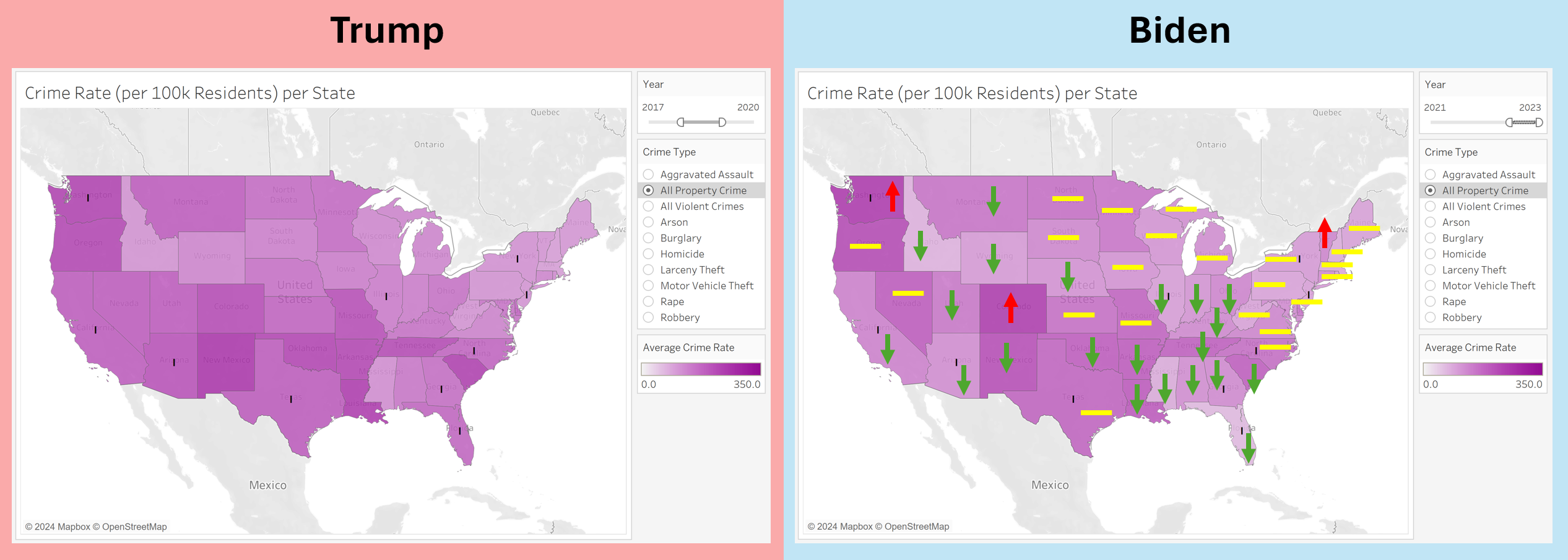
We can make the following observations from the visualization:
- Under both administrations, the top 10 states for undocumented immigrants are not the states with the highest rates of property crime. This further emphasizes and highlights that there is no relationship between undocumented immigrants and high crime rates.
- Biden’s map exhibited a reduction in property crime rate across a vast majority of the states, with the rest maintaining a similar crime rate to Trump’s map, and very few exhibiting an increase in the crime rate. This negates the narrative that crime went up and was out of control under Biden’s administration, as in fact it was reduced in most states!
- It seems that there is no observable geographical pattern for regions where crime rates decreased or increased under Biden’s administration.
Case Study 2: A Comparison of Refugee Rate
In the first case study, we look at the rate of refugees per 1M residents in each state under both administrations, where the saturation of the color of a state encodes the average refugee rate over the period being studied. Again, the letter I on the map is used to highlight the top 10 states that undocumented immigrants flow to, and the arrows on the states under Biden’s map indicate the direction of the change in refugee rate from Trump’s map.
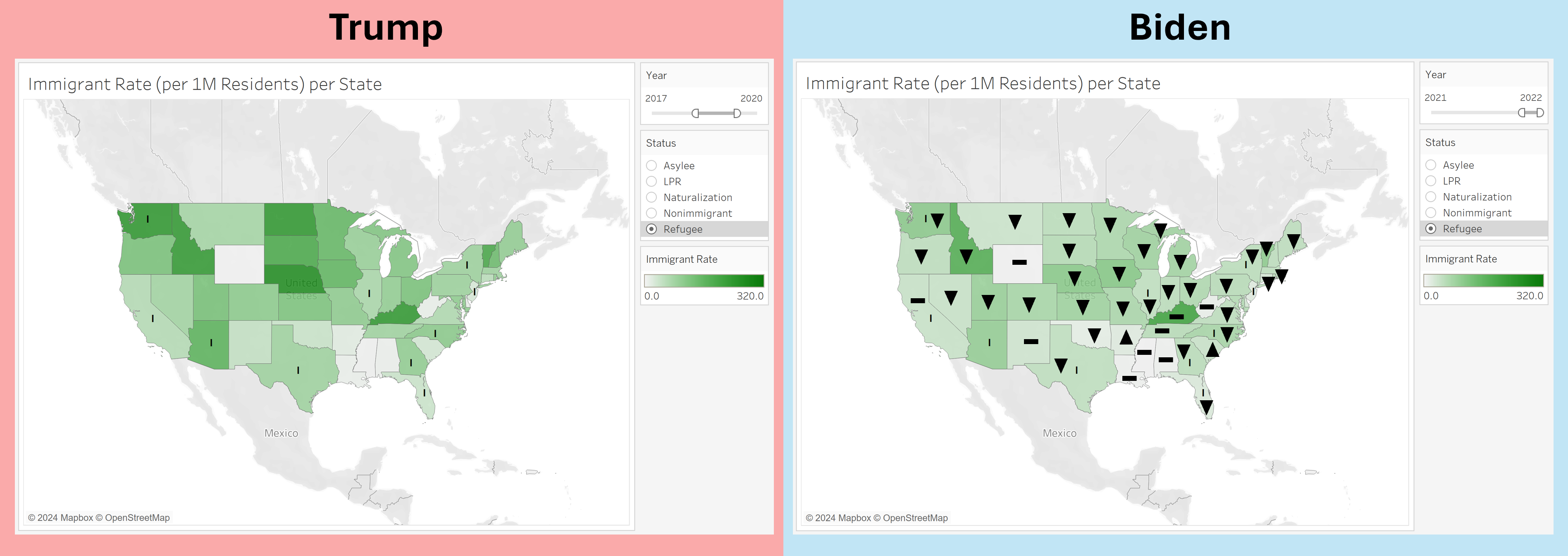
We can make the following observations from the visualization:
- Surprisingly, it turns out that refugees are generally not mainly concentrated in the top 10 states for undocumented immigrants. This pattern can be seen on both maps and may be a result of refugees having different circumstances from undocumented immigrants, and therefore requiring different types of resources and policies.
- Again, Biden’s map displays a sharp drop in refugee rate across most states when compared to Trump’s map. This again negates the narrative that Biden left the country open for anyone to enter. However, as mentioned previously it is important to note the effect of COVID on these results.
Exploratory Tool
Below you can find the tool we used to generate the previous two views, but you can choose the type of crime, immigrant status, and time ranges for both. We hope you can make interesting insights using this tool!
Exploring Crime and Immigration Trends Simultaneously
The past few visualizations had a relatively narrow focus, which allowed us to draw detailed and impactful insights from them to validate strong claims made by presidential candidates. However, we also want to look at the big picture. To do this, we developed a rich scatter plot that encodes many variables of the data and provides you with significant filtering capabilities.
Case Study 1: Violent Crime in the West and Naturalization Rate
The scatter plot shown in the figure below depicts the immigrant rate on the x-axis and the crime rate on the y-axis. The color of each mark encodes whether it is a sanctuary state, and whether the policy has been implemented or not yet. The size of the mark encodes the state population, and its shape encodes the type of crime. Filters are applied to show only violent crime in the West and the rate of naturalized immigrants. The plot shown is technically a connected scatter plot, with the history of each mark from 2015 to 2022 being shown via a dashed line.
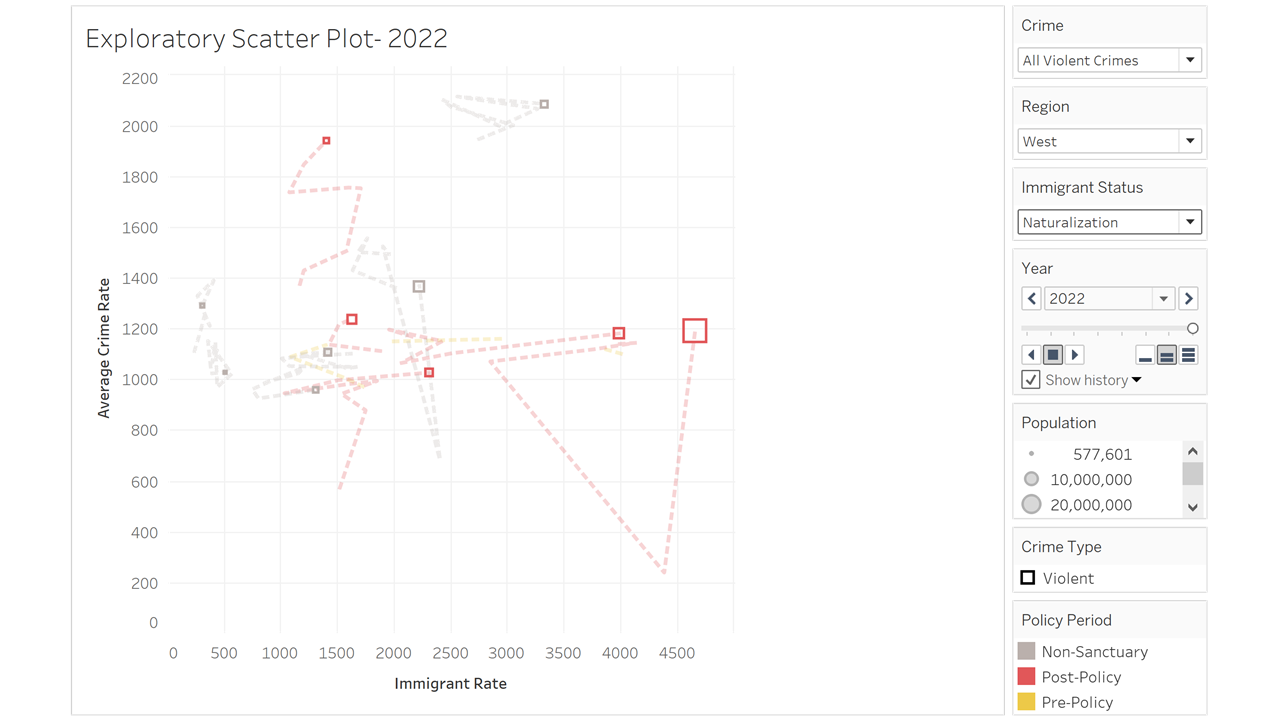
The following lists some of the observations that could be made from this visualization:
- There is no correlation between the violent crime rate and the rate of naturalized immigrants.
- States with a larger population tend to have a higher naturalization rate.
- Sanctuary states do not necessarily exhibit high rates of violent crime or naturalized immigrants.
- The history of states that implemented sanctuary policies shows that the naturalization rate increases after the policy is implemented, but the rate of violent crime does not. This again highlights the lack of relationship between immigrants and crime.
Case Study 2: Crime Rates in All Regions and LPR Rate
The scatter plot shown next uses the same system used to generate the previous one. However, this time no filtering is applied to the crime type or the region, and the immigrant status being studied is LPR. The year under study here is 2015, so no traces are shown on the scatter plot.
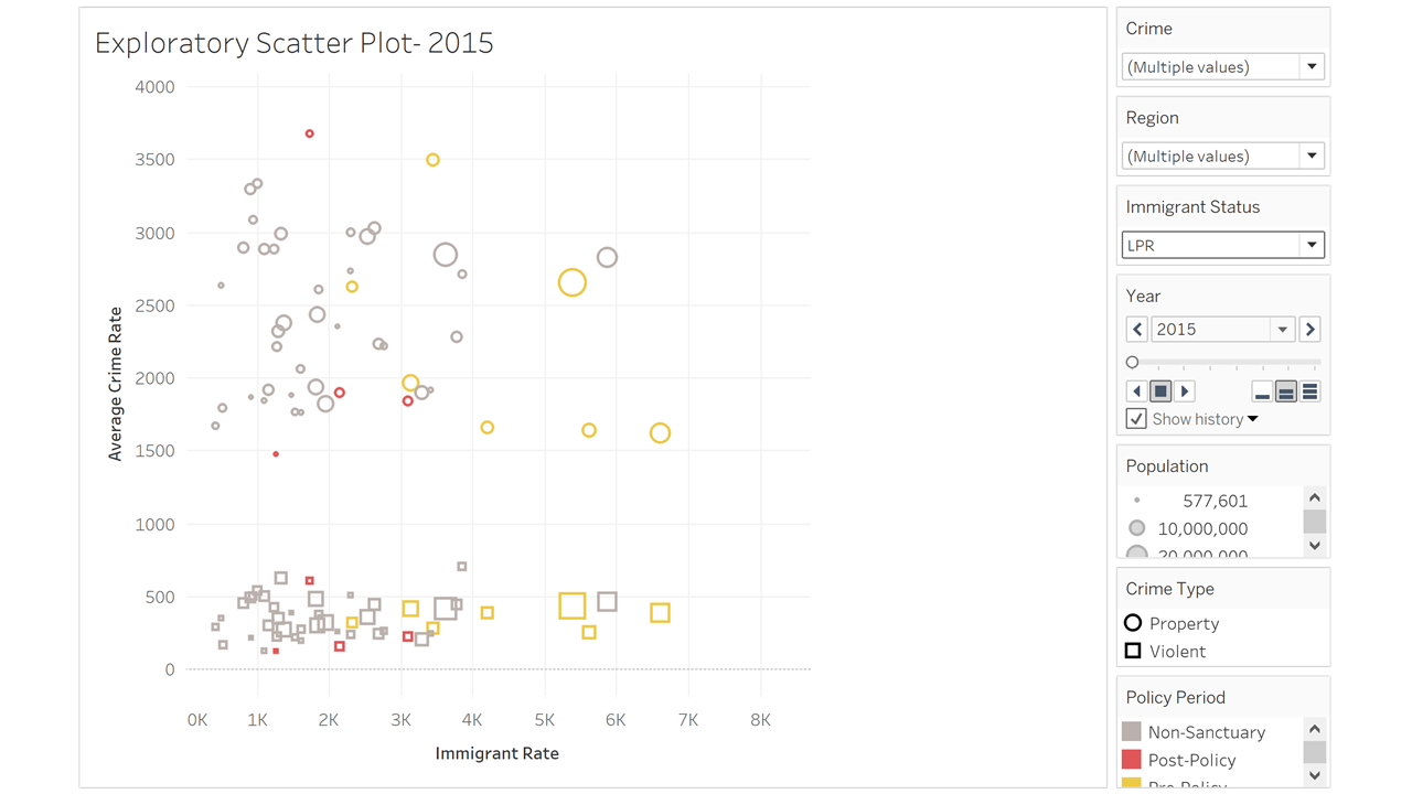
The following lists some of the observations that could be made from this visualization:
- There is again no correlation between crime rates and LPR rate.
- Property crimes tend to have a higher rate than violent crimes.
- States with a higher population tend to have a higher immigrant rate, but not necessarily a higher crime rate than states with a smaller population.
- Again, sanctuary states are not observed to exhibit higher crime rates than non-sanctuary ones.
Full Exploratory Scatter Plot
Now, we give you full control over the filtering and time travel in this powerful scatter plot. We hope it helps you gain more insight into the relationship between crime and immigration rates, how such rates vary in different regions of the country, the effect implementing a sanctuary policy, if any, can have on both rates, the history of each state, and much more.
Undocumented Immigrants and Taxes
Another claim made by President Donald Trump across multiple social media platforms and during live appearances is that undocumented immigrants are receiving Social Security and Medicare benefits and threatening the stability of both programs. Social Security benefits are payments made by the U.S. government to eligible individuals as financial support for retirement, disability, or survivorship. These payments are provided to individuals who have contributed to the Social Security system during their working years or meet specific eligibility criteria, which include having a Social Security number. Medicare is a federal health insurance program for people aged 65 or older and, in some cases, those who are younger with disabilities or fit specific medical criteria. Contrary to these claims, undocumented immigrants do not receive most federal benefits, including Social Security and Medicare. However, they still pay into these systems through payroll taxes, even though they are ineligible to collect the benefits they fund.
In addition to payroll taxes, undocumented immigrants contribute significantly to state and local tax revenues through property, sales, excise, and other taxes. These contributions are essential components of state and local funding, especially in areas with high immigrant populations. The following visualization highlights the total tax contributions made by undocumented immigrants in 2022 across the United States. The data used for this comes from the Federation of Tax Administrators and the Institute on Taxation and Economic Policy. This data provides insight into the economic role undocumented immigrants play, even in states that do not provide sanctuary protections.
Some of the observations that could be drawn from this visualization are the following:
- Undocumented immigrants contribute significantly to state and local taxes, even though they are ineligible for most benefits.
- States like California, New York, and Illinois show the highest tax contributions which may reflect their large immigration populations and sanctuary status.
- States with larger populations have a high correlation with higher tax contributions from undocumented immigrants.
Economy
Another hot topic in the most recent election was the economy. With the economic ramifications of COVID-19 and the political unrest around the world having a significant effect on the average American, people have been extra cautious when casting their votes as they look for policies that will improve their day-to-day lives. As a result, the US economy, the world’s largest as measured by GDP, remains a focal point of intense political debate, with candidates frequently making claims about their economic policies’ impacts. Both major parties assert that their leadership is better suited to improve the livelihoods of everyday Americans. While the president does not have direct control over the economy, they play a critical role in shaping the national economic agenda and tone. To evaluate these assertions, let’s consider some of the specific claims made by the candidates and analyze their validity.
President Joe Biden has frequently articulated his economic philosophy as “growing the economy from the middle out and the bottom up, not the top down,” arguing that his policies have directly benefited the average American. Former President Donald Trump has countered with claims such as, “We have set economic growth records, the likes of which we have never seen before,” often pointing to pre-pandemic economic indicators during his tenure.
This section examines these claims by analyzing key economic indicators, such as median household income and job growth, to determine which policies may have had a better impact on the American economy, and ultimately the day-to-day lives of the American people.
What Is the Economy?
Before diving into the claims, it’s important to define the term “economy” and select the metrics used to evaluate it. Common indicators include GDP, GDP growth, median wages, inflation, unemployment, job creation, and the S&P 500. Each metric has its strengths and limitations. For this analysis, we focus on median household income and non-farm job growth as they provide direct insights into the financial well-being of average Americans.
The analysis begins with a famous question from Ronald Reagan during the 1980 presidential debate:
“Are you better off today than you were four years ago?”
By examining trends in these metrics, we aim to assess the validity of economic claims made by Biden and Trump.
Median Household Income
To evaluate claims about improving the average American’s financial standing, we examined median household income using data from the U.S. Census Bureau.
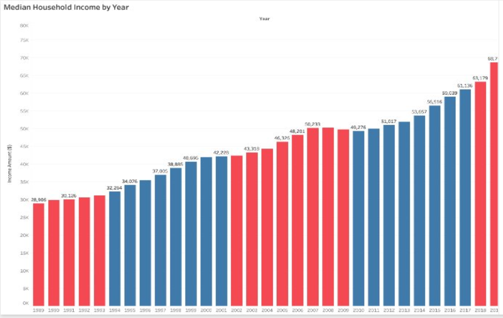
Median household income rose approximately 24% during the Obama/Biden administration, reflecting a steady recovery from the Great Recession. During Trump’s presidency, incomes increased by 12% in the first two years before the COVID-19 pandemic disrupted the economy. It’s worth noting that Trump inherited a strong economic foundation with historically low unemployment and high GDP growth, bolstered further by the 2017 tax cuts. These cuts likely contributed to short-term increases in income, aligning with Trump’s claim of record growth before the pandemic.
While both administrations oversaw income growth, these numbers alone don’t capture the broader economic landscape. Biden inherited an economy ravaged by the pandemic but presided over policies aimed at recovery, such as stimulus packages and investments in infrastructure. These actions reflect his stated philosophy of prioritizing middle- and lower-income Americans, thereby validating his claims.
Job growth (Non-Farm)
Job creation is another critical measure of economic performance. Using data from the Bureau of Labor Statistics (BLS), we compared job growth trends across administrations.
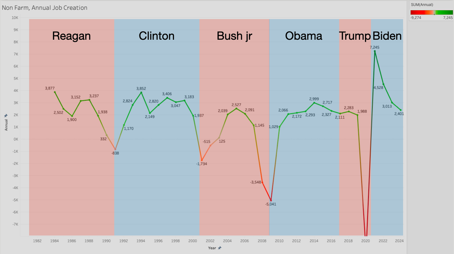
We managed to gather data from the Bureau of Labor Statistics (BLS) and mapped the job growth/losses and color-coded the years with the color of the party that controlled the presidency. Right off the bat, an interesting trend is visible. Republican presidents frequently leave office with some kind of economic crisis (we are not stating that they are responsible).
From 1980 onward, job growth trends across presidential terms reveal notable differences in economic performance, particularly under the Biden/Harris and Trump/Pence administrations. Excluding the anomalous years of 2020 and 2021 due to the COVID-19 pandemic, Biden/Harris have overseen a robust rebound in non-farm job growth, averaging approximately 4.5 million jobs added annually during their first two years in office. This is a stark contrast to Trump/Pence’s term, which, pre-pandemic, averaged about 2.3 million jobs per year between 2017 and 2019. While Trump’s early years reflected consistent job creation, Biden’s administration stands out for its rapid recovery and significant gains as the economy bounced back from the pandemic-induced downturn.
Again, it is important to remember that Trump inherited low unemployment from Obama (which does also make it harder to show strong job creation), but also averaged fewer jobs created than his predecessor and successor.
Student Loans
What Are Student Loans?
A final topic on which there was much discord in the previous election was student loans. Put simply, student loans are financial tools that help individuals cover the cost of higher education, including tuition, housing, and other expenses. Federal loans, provided by the government, are among the most common, with varying types for undergraduate and graduate students. Below, we try to take a closer look at why student loans are important as well as defining some of the important concepts related to them. We then examine some claims that were made about them by the presidential candidates.
Why Are Student Loans Important?
In the United States, student loan debt exceeds $1.7 trillion, affecting nearly 45 million Americans. Student debt can impact quality of life, delay home ownership, and even affect career choices. This issue has been central to recent presidential debates, with candidates proposing different solutions, including loan forgiveness and income-driven repayment plans. Understanding the nuances of student loans—who carries this debt, how it’s distributed across demographics, and how it impacts economic choices—is essential to informed voting on related policy proposals. All the data for this section is collected from the FAFSA website, which is a reliable and official source.
How Do Student Loans Affect Americans?
This section will visualize data on student loans by age, education level, institution type, and major. We’ll look at:
- Loan Type: Federal undergraduate vs. graduate loans.
- Age & Marital Status: How debt varies by age and marital status.
- Institution Type: Comparing debt across public, private nonprofit, and for-profit institutions.
- Major: Which fields of study correlate with higher debt levels, reflecting varying educational costs and potential income after graduation.
Terminology to Know
- Federal Undergraduate Loans: Loans issued by the federal government for undergraduate students, often with lower interest rates and varying repayment options.
- Federal Graduate Loans: Loans available for graduate students, often at higher interest rates.
- Loan Forgiveness: Programs or policies that relieve borrowers from repaying part or all of their federal loans.
- Income-Driven Repayment (IDR): A repayment plan that bases monthly payments on the borrower’s income and family size, intended to make repayment more manageable for low-income earners.
Student Loan Trend
The report from Education Data Initiative shows that the student loan debt in the US sums $1.753 trillion. The line graph below highlights the significant increase on students and graduates. The steep growth in national student loan debt in the US underscores the urgency for policies to address student loan debt sustainability for future generations.
Biden/Harris Administration claims, “We have reduced the burden of student loans through forgiveness programs, repayment pauses, and limiting interest accumulation.” On the other hand, Trump remarks, “Our administration focused on minimizing federal overreach, promoting private-sector alternatives, and limiting unnecessary loan expansions.” Under Biden’s presidency, his initiatives such as cancellation of up to $20,000 in student loans and repayment pause extensions contributed to decreasing the increasing trend of federal loans in the US by bringing the national loan amount by $0.03 trillion. This is indeed reflected in the line graph shown below, which confirms the claims made by the Biden/Harris administration. Conversely, while the plot shown cannot be utilized to conclusively confirm or disprove Trump’s claim, it ultimately demonstrates that his administration’s efforts did not attempt, or at least succeed at reducing national student loan debt.

Student Loan by Category
The bar graph below unpacks the complexities of student loan debt through three major lenses: Institution Type and Major, Racial and Gender Disparities, and Personal Circumstances, offering crucial insights that can shape your understanding of education policy debates.
Diving deeper into each claim made by each candidate, it’s clear that Harris promotes the Biden administration’s forgiveness programs and expanding income-driven repayment (IDR) plans like SAVE, capping payments to reduce monthly burdens. On the other hand, Trump administration will work on streamlining loan programs by consolidating federal repayment plans into fewer, simpler options. Furthermore, Trump expressed an intent to reduce the government’s role in student lending, encouraging private-sector competition, bettering student loan rates, etc.
Harris administration is most likely to target black and Hispanic borrowers, those unmarried with dependents, for-profit borrowers and those in healthcare fields. In contrary, Trump will likely aim for 30/older individuals, those who are in/went to private nonprofits, engineering & computer science students and male borrowers. In the following two, we study how each group of people in each category are affected by student loan debt.
Key takeaways:
- Harris administration focuses on forgiving significant amounts for borrowers, especially those marginalized or pursuing advanced degrees. Furthermore, forgiveness programs will target high-debt sectors or racial inequities. To keep in mind is that forgiveness efforts largely focus on smaller groups with graduate loans.
- The main emphasis of Trump administration would be to reduce borrowing for graduate students. The streamlining repayment or partnering with private lenders will help older borrowers and private nonprofit students. A warning may be that graduate students at for-profits or in healthcare bear high debt burdens but are less likely to benefit from a repayment strategy that doesn’t include targeted relief.
How would student loan forgiveness impact the average borrower?
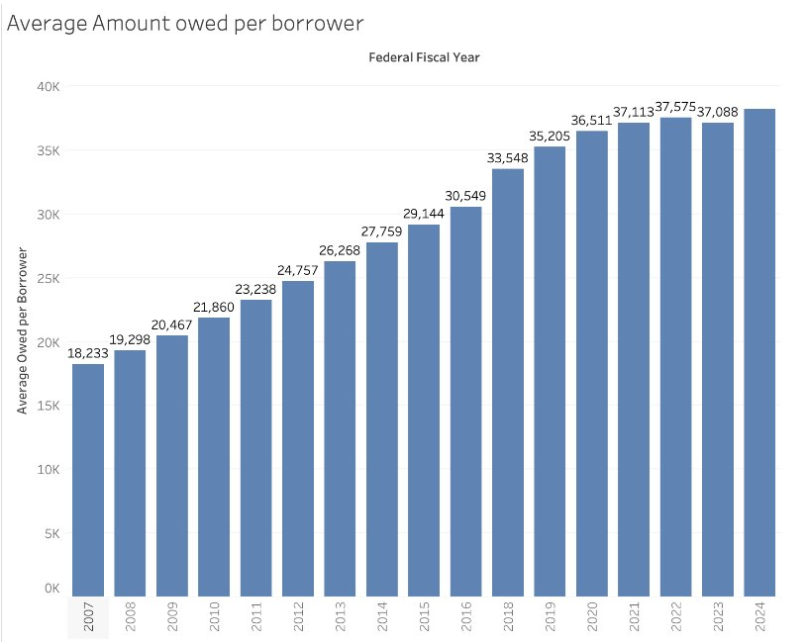
Let us start by examining the average amount owed per borrower. This value was calculated by dividing the total amount of federal student loans divided by the number of unique borrowers. This value has steadily grown every year at roughly the same amount. Only recently, under the Biden administration have we seen dips in the amount owed.
We read through both campaign websites to get a better understanding of the exact claims made by candidates regarding student loan forgiveness. The Harris/Walz campaign is for student loan forgiveness, but the Trump/Vance ticket does not make specific claims either for or against. However on the campaign trail, former president Trump has argued against student loan forgiveness.
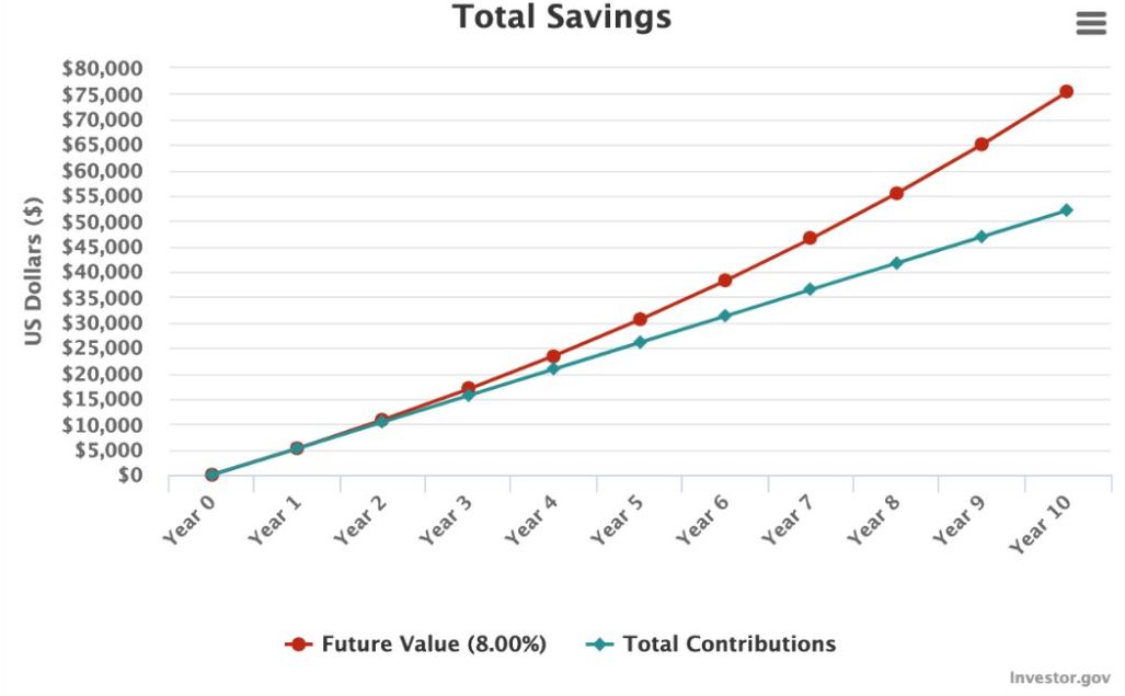
In this hypothetical example, we consider what would happen if student loan forgiveness became policy. The average monthly payment for a federal student loan with a 10-year term at a 6.8% APR of 38000 is 430$. Again, this 38000$ figure comes from dividing the total outstanding amount by the number of unique borrowers. If the debt was cancelled and the borrower put this into a stock market index fund tracking the popular S&P500 ETF (like SPY), they would end up with 75,000$
Considering the average home price is 400,000$, with a little more saving, that could be a downpayment on a house!
Final Takeaway
While this project might be coming a little too late (since the elections already happened), we hope that it serves as inspiration for individuals to go out and do their own research before casting their votes. Voting is a very big responsibility, and therefore one should not take it lightly or base it solely on claims or anecdotal evidence provided by politicians. Instead, it should be based on sound research and the thorough examination of the facts at hand.
References
FBI Crime Data Explorer Crime data for all crimes and all states
State immigration data from Office of Homeland Security Statistics Immigration data for all immigrant statuses and all states
Undocumented immigrant estimates from Office of Homeland Security Statistics Estimates of the Unauthorized Immigrant Population Residing in the United States
State population data from 2010 to 2019 State Population Totals and Components of Change: 2010-2019
State population data from 2020 to 2023 State Population Totals and Components of Change: 2020-2023
Remarks by president Trump on undocumented immigrants Trump says immigrants are ‘poisoning the blood of our country.’
Various remarks and claims made by both president Trump and vice president Harris Fact checking debate claims from Trump and Harris’ 2024 presidential faceoff
Remarks by vice president Harris on the flow of immigrants into US under Biden’s administration Fact Check: Kamala Claims Biden Admin Has Halved ‘Flow of Immigration’
Remarks and claims by President Trump on undocumented immigrants and federal benefits Misinformation About Immigrants in the 2024 Presidential Election
Information on Tax Payments by Undocumented Immigrants - 2022 Tax Payments by Undocumented Immigrants
2022 US tax data for undocumented immigrants 2022 State Tax Revenue
Harris vs. Trump on student loans, education: Where they stand - washington post. Harris vs. Trump on student loans, education: Where they stand
A NEW WAY FORWARD FOR THE MIDDLE CLASS A Plan to Lower Costs and Create an Opportunity Economy. (n.d.).
Bureau of Labor statistics, jobs created per month https://data.bls.gov/pdq/SurveyOutputServlet
Remarks by president Biden on the American Economy - Bidenomics Bidenomics is working
Remarks by president Trump on the American Economy Trump at Davos
Compound interest calculator used for evaluating benefits of student loan forgiveness Calculator